Enter your email to receive the CareQuest newsletter:
April 30, 2025
By Beverly Bruno, MPH, Health Informatics Developer, CareQuest Institute
What makes a story stick isn’t always the plot — it’s the way it unfolds. At the 2025 Tableau Conference, where data accessibility and creativity led every conversation, it became clear: dashboards and data sets can be more than static displays. They can be dynamic stories, each with its own rhythm, architecture, and power to connect.
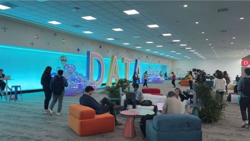
With more than 300 sessions, hands-on trainings, networking events, and fan favorites like Iron Viz, Devs on Stage, and Data Night Out, this conference brought together data enthusiasts from across the globe. Attendees ranged from seasoned Tableau users and data analysts to business leaders, all looking to unlock new possibilities for themselves, their teams, and their organizations.
For me, a health informatics developer at CareQuest Institute and a first-time attendee, it was a fantastic opportunity to see how I can improve the way our community interacts with our growing collection of oral health data. The experience reinforced something I’ve always believed: Data isn’t just numbers on a screen — it’s a language.
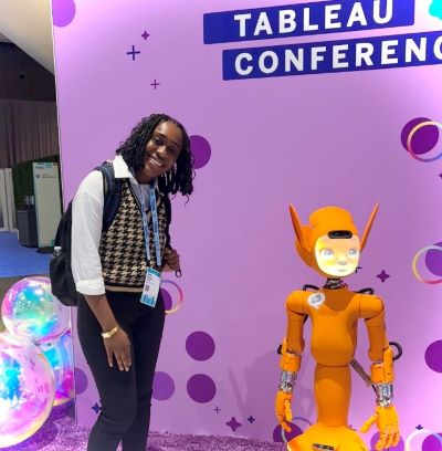
I love data because it gives shape to uncertainty. It anchors ideas in evidence yet leaves room for creativity in how we interpret and share it. Whether I’m visualizing national oral health trends or building dashboards to support advocacy, data offers both a compass and a canvas. Being in a space surrounded by others who see data as a tool for storytelling, connection, and impact made me feel right at home. Plus, I even got to meet a few robots — proof that in the world of data, anything’s possible.
What’s Everyone Talking About? Trends in Data Visualization and Insights
What’s the point of writing a book or designing a graphic novel if no one reads it — or understands it? This gap in accessibility is exactly what fuels the growing movement toward “data democratization.” Democratizing data isn’t just about handing over spreadsheets; it’s about engineering experiences that make data clear, usable, and actionable for everyone, not just technical experts.
One standout session entitled “Tableau Meets Comics: Data Storytelling Reimagined,” led by Swissquote Bank Data Analyst Shazeera Zawawi, explored how comic book storytelling techniques can transform dashboards into engaging narrative journeys. Comics pull you in because you root for characters to succeed and because the visual structure — the layout, pacing, and flow of panels — creates emotional momentum. Zawawi demonstrated how dashboards can mirror these techniques to guide users through data stories by shaping the rhythm and highlighting key moments. Her core lessons included:
- Visual decompression: Incorporate simplified visualizations where appropriate to reduce cognitive load, improve interpretability, and ensure key findings stand out without overwhelming users.
- Emphasis timing: Deliberately highlight critical insights at high-impact moments within the user flow to enhance retention, engagement, and narrative continuity.
- Facilitated comprehension: Employ creative visual and narrative cues to translate complex datasets into intuitive, easily navigable formats, broadening accessibility for nontechnical audiences.
- Narrative pacing and structural flow: Manage the rhythm of information delivery through intentional layout design, using panel size, sequence, and transitions to guide emotional and cognitive engagement.
You can check out the following dashboards “inspired by comics” below, as presented by Zawawi:
- A Decade of Live Music by Shazeera Ahmad Zawawi: View Viz
- The Avengers: A Tableau Comic Book by Jade Corley: View Viz
- Data Comic: il Salone del Mobile 2024 by Visualitics: View Viz
- Marvel Comic Characters by Sanjeev Sahu: View Viz
- Manga: The Japanese Comic Sensation by Zak Geis: View Viz
- The Colours of Tintin by Marian Eerens: View Viz
Zawawi’s session made a clear case: Designing for data accessibility is like crafting a great comic — it’s about timing, structure, and emotional connection. While comics may seem unconventional for data storytelling, their techniques offer powerful lessons. Democratizing data means pacing information thoughtfully, designing interfaces that invite exploration, and bridging gaps between technical and nontechnical audiences — giving people the ability to understand and act without needing a PhD in statistics.
Prioritizing Usability and Accessibility in Dashboard Design
Another critical trend gaining momentum is designing dashboards with usability and functionality first — with interactivity as the engine. How users interact with a dashboard shapes how easily they explore, interpret, and act on data and determines how well the visualization connects across different audiences. Interactivity isn’t just about convenience; it’s about accessibility — ensuring visualizations are welcoming and usable for everyone, including individuals with disabilities.
In “Dash Smarter, Not Harder: Designing Impactful Dashboards,” Salesforce presenters Christian Felix and Lisa Karnofski emphasized designing with accessibility in mind, particularly for users with color blindness, which affects 7%–10% of men and 0.5% of women. They shared practical strategies for choosing accessible color palettes based on three common types of color blindness:
- Deuteranopia (green weakness)
- Protanopia (red weakness)
- Tritanopia (blue weakness)
They also shared these best practices for color and accessibility:
- Use color to communicate meaning, not just to decorate.
- Limit to eight or fewer colors per visualization.
- Match the color palette to the type of data:
○ Categorical: distinct hues for different groups
○ Sequential: gradations of a single hue for ordered data
○ Diverging: two contrasting hues centered around a midpoint for highlighting differences - Make critical information easy to find and interpret.
- Eliminate unnecessary visuals that distract from key insights.
Felix and Karnofski also demonstrated ways to enhance dashboard interactivity using Tableau features like Parameters and Actions. Parameters are customizable controls that let users adjust views without changing the underlying data, while Actions create interactive experiences — such as clicking to filter or reveal more details. Examples included:
- Building dynamic date hierarchies with custom buttons
- Allowing users to modify observation attributes directly
- Adding sliding reference lines that respond to user input
My Takeaway: Data Visualization Builds Relationships
Data visualization isn’t just about charts and numbers — it’s about connection. At the 2025 Tableau Conference, one of my personal highlights was attending the Women in Data meetup on the first day. It was incredible connecting with other women, hearing about their journeys into data analytics, and learning about the industries they’re shaping — from finance to freelance.
Another unforgettable moment was walking through the Symposium area and witnessing the live Iron Viz data visualization competition. In this high-stakes challenge, three finalists from around the world are given a dataset about a month in advance and tasked with building a dashboard in just 20 minutes — live on stage. Their work is judged on analysis, storytelling, and design. This year’s topic? Wildlife aviation strikes. It was thrilling to see how each contestant used the same dataset but brought such different perspectives — from radial bar charts to clever tooltip applications. Their creativity and technical prowess were genuinely inspiring.
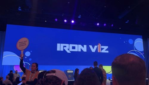
You can check out the Iron Viz 2025 finalists’ dashboards below:
- Two Eras of Safety (Iron Viz 2025 Winner) by Bo McCready: View Viz
- Wildlife Strikes by Kathryn McCrindle: View Viz
- A Flight Less Travelled by Ryan Soares: View Viz
This experience reflected one of the biggest themes of the conference: good data design requires empathy — understanding your audience, seeing through their eyes, and building experiences that resonate.